Buttons
Here you can customize the buttons that are shown to the visitors of the Shop.
1. Simple customization: Button sets
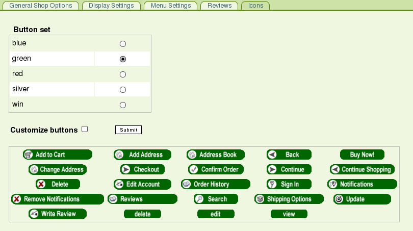
It is possible to choose among pre-defined Button Sets. Just pick a color, select it using the radio buttons and click "Submit".
2. Advanced customization: Global Buttons Style
To unleash the power of CSS to customize the Shop Buttons, tick the Customize Buttons checkbox and click "Submit". The "Global Buttons" section appears:
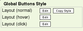
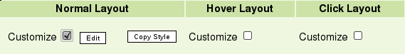
Let's click the Layout (normal) "Edit" button. A pop-up appears, in which you can configure the CSS attributes. For the example, we will set:
- Font weight : Bold - Size : Larger - "Solid" Border of 1 pixel on each side |
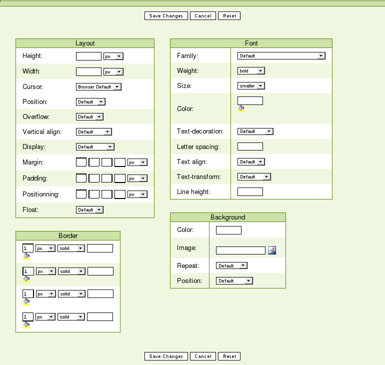
When done, click the "Save Changes" button. The changes should now be reflected in the "Button Preview" column of the Buttons List.
Now let's click the "Copy Style" button so as to use the CSS we just made as a basis for the other states of the buttons.
A pop-up message indicates that the copy was performed succesfully.
We will now edit the "Hover" state CSS. Let's assign the #FF6600 (Orange) color to the Font and the Border. For the "Click" state we will do the same using the#FF0000 (Red) color.
The "Button Preview" column of the Buttons List should now show the expected behaviour.
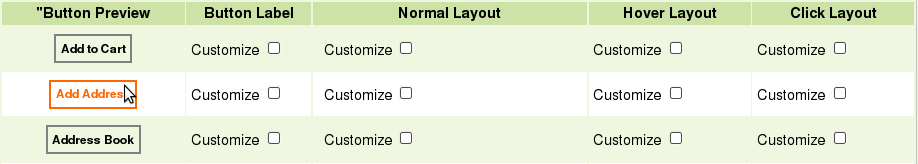
3. Even more advanced customization : Per-Button Customization
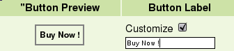
You may now enter a custom label for specific buttons. For instance, We will enter "Buy Now !" as a label for the "Add to Cart" button. To do so, tick the "Customize" checkbox in the Button Label column.
It is also possible to define specific CSS properties for a given button. Just tick the "Customize" checkbox under the column corresponding to the State you want to modify (i.e. Normal, Hover, and/or Click). Following the same logic as for the global button styles, you can copy the Normal state to use as a base for Hover and Click states.